
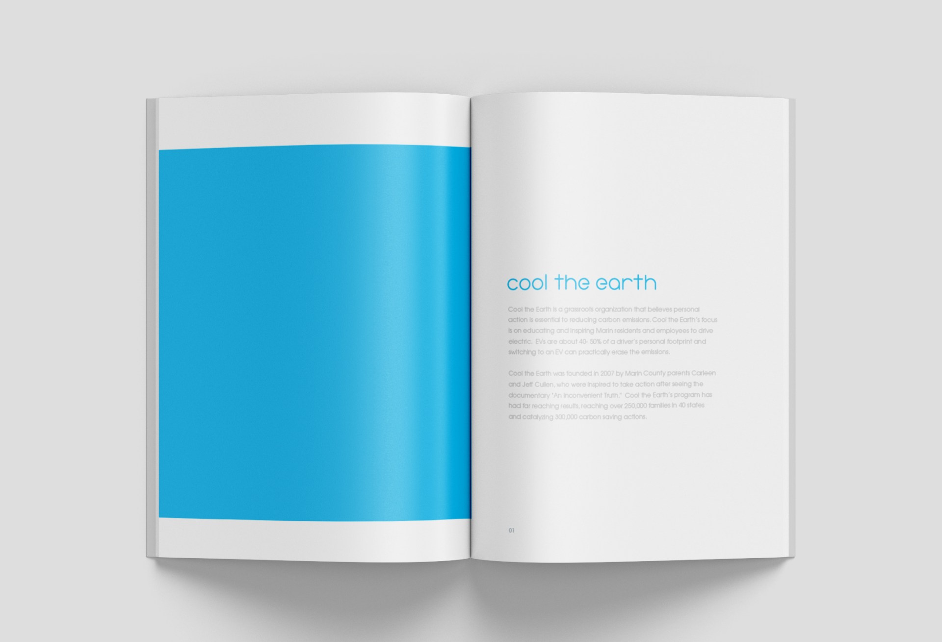
Cool The Earth was focused on combatting climate change through educating children on the topic, but wanted to move toward promoting electric vehicles. We were brought in to help with a full rebrand.
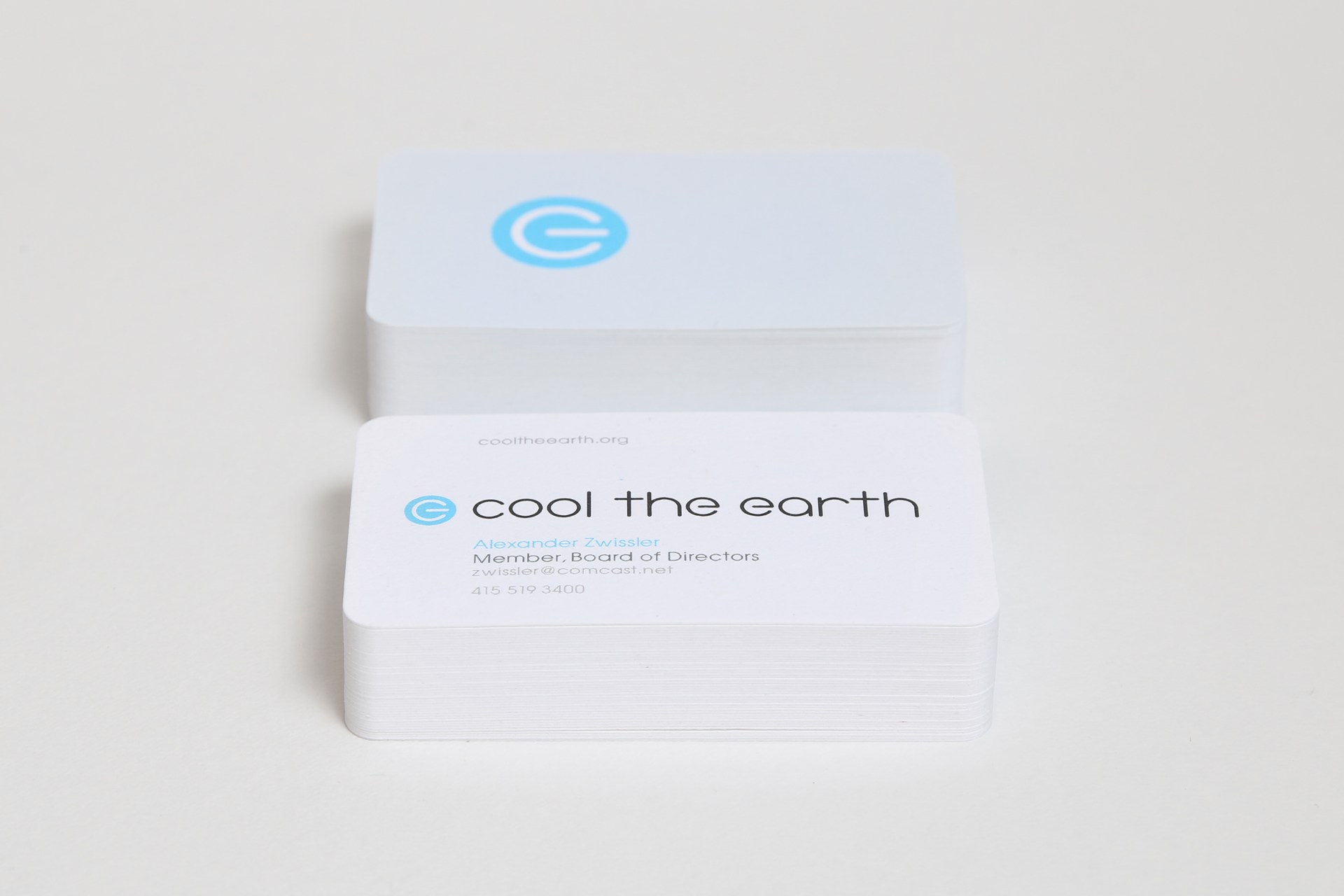
The “Power Logo” as we call it, is very literally derived from the electric power button on most electric vehicles as well as many modern electric devices. The icon is rotated 90 degrees clockwise and modified to create “CTE”, the acronym of Cool The Earth. CTE lies within a pure cool blue sphere representing our planet earth in it’s ideal state. The typography was created custom as an extension of the letter forms in the logo.
![]()
We created a full brand guidelines to inform future design decisions.


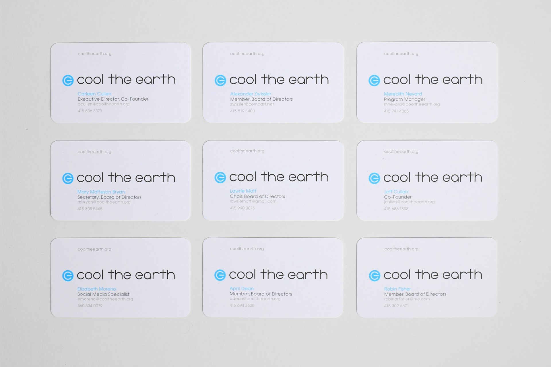
We printed their business cards with Moo.com on recycled cotton t-shirt offcuts, so no trees were harmed in the production process.

Services: Creative Direction / Brand Strategy / Art Direction / Design
Client: Cool The Earth
