
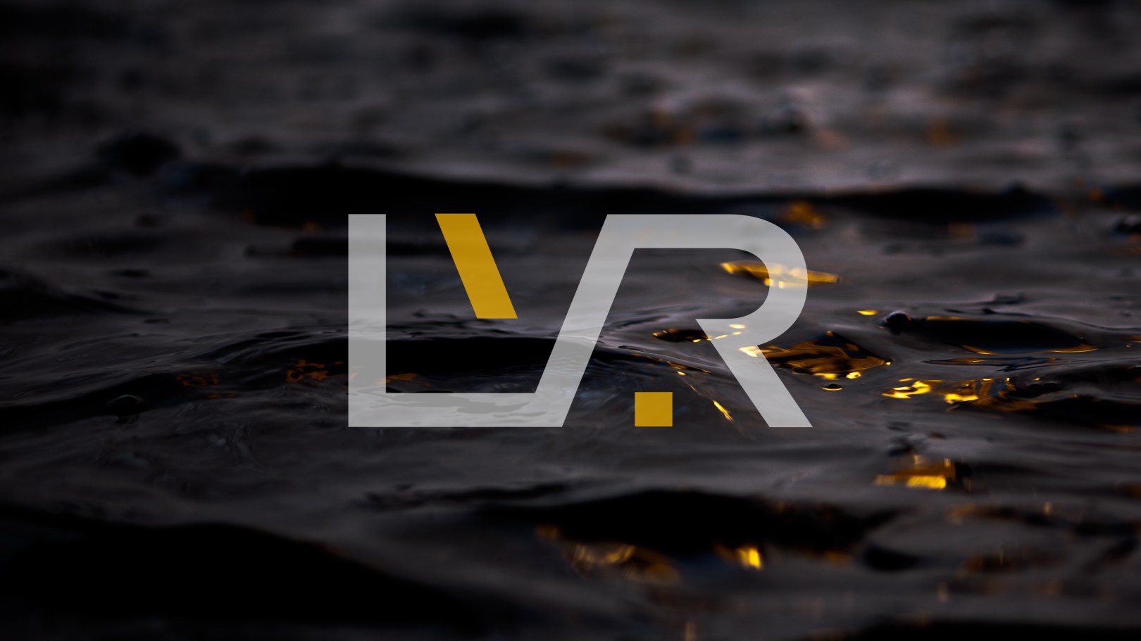
La Vida Rica is a luxury brand in its early stages of development. In Spanish it means “The Rich Life”. The word “Rica” has a double meaning: “Wealthy” when referring to people, and “delicious” when referring to food and drink.
The connectedness of the LVR in the mark is reflective of the brand’s offering of multiple luxury products (coffee, chocolate, cigars and spirits) that all deliver on the promise of a “rich life”. The mark also visualizes the innate connection between people who share this rich approach to la vida.

The backslash is a symbol of relaxed state of mind, while it’s forward angle indicates constant progress. The square period is a reminder that life is finite, and even though hard work is cherished, we must remember to pause, relax, and enjoy the finer things that life has to offer. These are utilized as fixed elements within the mark, but can also be used as separate elements within design applications.
Brand guidelines in progress…
Services: Creative Direction / Brand Strategy / Branding / Design
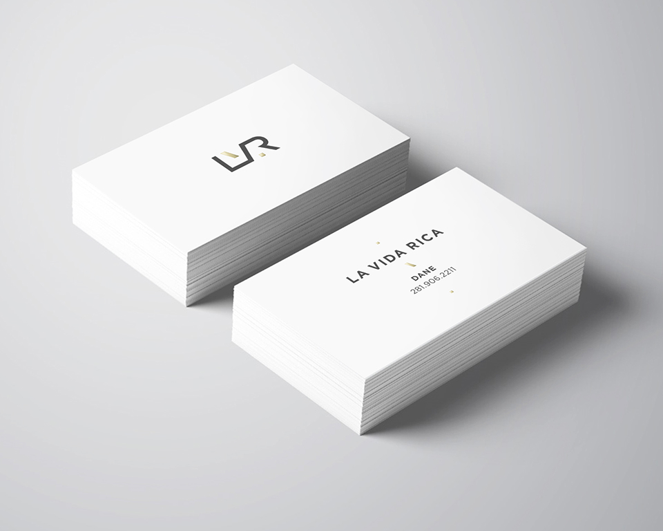
Client: La Vida Rica Luxury Products
